

By Saad Iqbal
Your water injection well has been taking 1,250 bbl/d like clockwork for a year. The rate hasn’t moved. The pump hasn’t changed. But the bottomhole injection pressure needed to push that same barrel in keeps creeping up, month after month, and nobody on the surveillance team has flagged it yet. That’s the trap with constant-rate injection: the rate gauge lies to you by omission. It tells you everything is fine right up until the near-wellbore region has silently choked down and you’re staring at a workover.
The Hall plot is the fix. It’s a 1963 technique that is still the fastest way to catch injectivity decline, mechanical skin, or an unplanned frac out of water injection well surveillance data, using numbers you already record. No special software, no new sensors — just the pressure and rate data sitting in your daily injection log. This Hall plot analysis tutorial walks through it step by step, with a governing equation, worked numbers, and Python code you can run on your own well today.
What a Hall Plot Actually Tells You
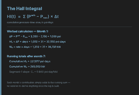
A Hall plot takes two cumulative quantities and puts one against the other: the Hall Integral, HI(t) = Σ(Pwh − Pres) × Δt, on the y-axis, against cumulative water injected, Wi(t), on the x-axis. For a well injecting at a steady rate with stable near-wellbore conditions, that plot is a straight line. The slope of that line, C, is a direct, model-free readout of injectivity.
Here’s why engineers like it: you don’t need a reservoir simulator to use it. A rising slope means the well is getting harder to inject into — skin damage, fines migration, or scale. A falling slope often means improving injectivity, which on a water injection well usually means you’ve exceeded formation parting pressure and started an unplanned fracture. Either direction, the shape of the line tells you something is changing before a workover crew shows up to confirm it the hard way.
Prerequisites
A monthly (or more frequent) injection surveillance log with wellhead or bottomhole injection pressure and injection rate · static reservoir pressure, Pres · basic reservoir properties (permeability k, net injection interval h, injected-water viscosity μ and formation volume factor B, drainage radius re and wellbore radius rw) if you want to convert slope into a skin factor · Python 3 with pandas and NumPy, or a spreadsheet, for the automation step
Step 1 — Pull Your Injection Surveillance Data
Start with the raw log: date, injection rate, and wellhead or bottomhole injection pressure, at whatever frequency you record it (daily is ideal, monthly works fine for a trend-level Hall plot). You need at least six to twelve data points to see a trend with any confidence — two or three months of data will just show you noise.
Why this step matters: the Hall plot is only as good as the surveillance data feeding it. Pressure gauges drift, rate meters get recalibrated, and a single bad reading can fake a slope break that isn’t real. Scan the raw log for gaps and obvious outliers before you trust anything downstream.

Step 2 — Know the Governing Equation
The Hall plot slope connects directly to the radial injectivity (Darcy) equation for a water injection well:
C = 141.2 · μ · B / (k · h) · [ln(re/rw) − 0.75 + s]
where C is the Hall plot slope in psi·day/bbl, μ is injected-water viscosity in cp, B is the water formation volume factor in rb/stb, k is permeability in md, h is net injection interval in ft, and s is the dimensionless skin factor. Everything in that bracket is fixed for a given well except s — which means once you know C from the plot, you can solve directly for how much skin has built up.
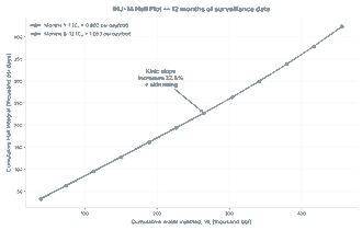
Worked example. Take a water injection well with k = 31.0 md, h = 35.0 ft, μ = 0.55 cp, B = 1.01 rb/stb, re = 745.0 ft, and rw = 0.354 ft, injecting a constant 1,250 bbl/d against Pres = 2,150 psi. Months 1–6 give a Hall plot slope C1 ≈ 0.87 psi·day/bbl; by months 7–12 the slope has climbed to C2 ≈ 1.06 psi·day/bbl — a 22.5% increase. Plugging each slope into the equation above and solving for s gives a skin factor rising from s1 ≈ 5.1 to s2 ≈ 7.8 over the same year. That’s a real, measurable near-wellbore damage trend, not noise.
Step 3 — Build the Hall Plot
Now turn the surveillance log into the plot itself. For every data point, compute the running cumulative water injected, Wi(t), and the running cumulative Hall Integral, HI(t) = Σ(Pbhip − Pres) × Δt. Plot HI on the y-axis against Wi on the x-axis. If the well is behaving, you’ll see a single straight line. If something changed partway through the data, as in this example, you’ll see two distinct straight-line segments meeting at an inflection point.
Why this step matters: fitting a single slope across the whole 12 months here would average away the real story. Fitting separate windows — before and after the visible break — is what actually exposes the 22.5% slope increase instead of hiding it inside an “average” trend line.
Step 4 — Read the Slope Like an Engineer
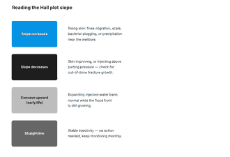
Once you have the slope (or slopes), the diagnosis is almost mechanical:
- Rising slope, straight line: gradual injectivity decline — fines plugging, scale, or bacterial fouling near the wellbore.
- Sharp upward break: a step-change event — a workover, a choke change, or a sudden plugging episode.
- Falling slope: improving injectivity — often means you’ve gone above formation parting pressure and are fracturing the injection zone, intentionally or not.
- Flat, unbroken line: stable injectivity — the well is behaving exactly as designed.
In this well, the injectivity index — rate divided by the pressure differential needed to inject it — falls from about 1.11 bbl/d/psi at month 6 to about 0.90 bbl/d/psi at month 12, an 18.6% decline. That’s the practical, bottom-line number to carry into a well review: the same 1,250 bbl/d now costs noticeably more pressure to deliver than it did six months earlier.
Step 5 — Automate It in Python
Doing this by hand in a spreadsheet works for one well. It falls apart fast across a waterflood with dozens of injectors. Here’s a self-contained Python script, built on pandas and NumPy, that reproduces every number above from a surveillance log and the governing equation — copy, paste, and point it at your own well’s data:
import numpy as np
import pandas as pd

# --- 1. Monthly injection surveillance log ---
log = pd.DataFrame({
    "month":     list(range(1, 13)),
    "bhip_psi":  [3175, 3195, 3215, 3235, 3255, 3275,
                  3400, 3426, 3453, 3480, 3506, 3532],
    "rate_bpd":  [1250.0] * 12,
})

PRES = 2150.0   # psi, static reservoir pressure
DT   = 30.4     # days per month

log["dP_psi"]     = log["bhip_psi"] - PRES
log["Wi_cum_bbl"] = (log["rate_bpd"] * DT).cumsum()
log["HI_psi_day"] = (log["dP_psi"]   * DT).cumsum()

# --- 2. Fit the Hall plot slope before/after the break ---
early, late = log[log["month"] <= 6], log[log["month"] > 6]
C1 = np.polyfit(early["Wi_cum_bbl"], early["HI_psi_day"], 1)[0]
C2 = np.polyfit(late["Wi_cum_bbl"],  late["HI_psi_day"],  1)[0]
print(f"C1 (months 1-6)  = {C1:.2f} psi-day/bbl")
print(f"C2 (months 7-12) = {C2:.2f} psi-day/bbl")
print(f"Slope increase   = {(C2 - C1) / C1 * 100:.1f}%")

# --- 3. Skin factor from the governing equation ---
# C = 141.2 * mu * B / (k*h) * [ln(re/rw) - 0.75 + s]
mu, B, k, h = 0.55, 1.01, 31.0, 35.0
re, rw = 745.0, 0.354
const, lnterm = 141.2 * mu * B / (k * h), np.log(re / rw) - 0.75
s1, s2 = C1 / const - lnterm, C2 / const - lnterm
print(f"Skin, month 6  = {s1:.1f}")
print(f"Skin, month 12 = {s2:.1f}")

# --- 4. Injectivity index, early vs late ---
II6  = log.loc[log["month"] == 6,  "rate_bpd"].iloc[0] / log.loc[log["month"] == 6,  "dP_psi"].iloc[0]
II12 = log.loc[log["month"] == 12, "rate_bpd"].iloc[0] / log.loc[log["month"] == 12, "dP_psi"].iloc[0]
print(f"II, month 6  = {II6:.2f} bbl/d/psi")
print(f"II, month 12 = {II12:.2f} bbl/d/psi")
print(f"II decline   = {(II6 - II12) / II6 * 100:.1f}%")
Expected Result and Verification
Running the script above against this well’s data should print a slope increase of about 22.5%, a skin factor climbing from roughly 5.1 to 7.8, and an injectivity index falling from about 1.11 to 0.90 bbl/d/psi — matching the worked example step by step. On your own well, swap in your real surveillance log and reservoir properties; the shape of the output should match the Hall plot you already built by eye in Step 3.
Three pitfalls to watch for before you trust the result:
- Using the wrong reservoir pressure. A stale or wrong Pres shifts the whole Hall Integral and can manufacture a slope break that isn’t real — update it from your latest pressure survey, not a type-log value from first production.
- Fitting across a rate change. The Hall plot assumes a reasonably constant injection rate. If rate stepped up or down mid-period, fit separate segments on either side of the change, not through it.
- Treating one month of data as a trend. A single outlier point can look like an inflection. Confirm any apparent slope break with at least two or three consecutive points before calling it real injectivity decline.
Once you’ve run this on one well, the natural next move is screening a whole waterflood pattern for the same signal — our guide to AI waterflood conformance and thief-zone detection picks up right where this leaves off, and if you want the producer-side counterpart to this diagnostic, the Horner plot pressure buildup workflow and nodal analysis operating-point walkthrough are built the same way — governing equation, worked numbers, then Python.
