

By Saad Iqbal
It’s 4:47 p.m. on a Tuesday in July, and the temperature outside has just cracked 41°C. Every air conditioner in the region kicks on within the same twenty-minute window, and somewhere in a control room, a load dispatcher watches a demand curve bend upward like a rocket clearing the tower. This is the moment every grid operator trains for and quietly dreads: the peak. Get the forecast right, and the lights stay on without anyone noticing. Get it wrong, and you’re either buying emergency power at eye-watering prices or explaining a rolling blackout to a very unhappy public.
I spent a few days this month trying to answer a deceptively simple question: using nothing but public data and a couple of AI tools, could I build a next-day electricity demand forecast good enough to actually be useful? Not a research paper, not a PhD thesis — something an engineer could run before their coffee gets cold. Here’s exactly how I did it, and what it taught me about where AI is genuinely changing energy engineering, and where it still needs a firm hand on the wheel.
Why a One-Day Forecast Is Harder Than It Sounds
Electricity demand looks like it should be predictable — humans are creatures of habit, after all. But a grid’s load curve is really the sum of dozens of overlapping rhythms: the daily commute, the school calendar, a heatwave rolling through three states, a factory’s shift change, a public holiday nobody remembers to flag in the training data. It’s less like reading a clock and more like predicting a tide, where you’re not tracking one gravitational pull but several, each with its own period and amplitude, all superimposed on the same curve. Miss one of those rhythms and your forecast quietly drifts off course exactly when it matters most — during the peak.
That’s the itch I wanted to scratch: not to build a perfect model, but to see how far a modern AI-assisted workflow could get me toward a usable one, using only tools that are actually available today.
Step 1 — Pulling Real Grid Data From the EIA
I didn’t want synthetic data, so I started with the U.S. Energy Information Administration’s Open Data API, which publishes hourly electricity demand by balancing authority and region, free, with a self-service API key. It’s the same public dataset analysts and utilities already lean on, which meant anything I built afterward would be grounded in numbers a real engineer could pull tomorrow morning.
Registering for a key takes about two minutes. Pulling a slice of hourly demand for a given region looks like this:
import requestsurl = "https://api.eia.gov/v2/electricity/rto/region-data/data/"params = { "api_key": "YOUR_EIA_API_KEY", "frequency": "hourly", "data[0]": "value", "facets[respondent][]": "PJM", "facets[type][]": "D", # D = demand "start": "2026-06-01T00", "end": "2026-07-01T00", "sort[0][column]": "period", "sort[0][direction]": "asc",}resp = requests.get(url, params=params)demand = resp.json()["response"]["data"]
That single call returns clean, timestamped hourly megawatt-hour figures going back years — the raw material for everything that follows.

Step 2 — Letting Claude Do the Data Wrangling
Raw grid data is never quite ready to model. There are missing hours around daylight saving transitions, occasional sensor dropouts, and time zones that need normalizing across regions. This is exactly the kind of unglamorous prep work where I leaned on Claude’s built-in code execution tool — the feature that lets Claude actually run Python against a dataset inside the conversation, rather than just describing code and hoping I typed it correctly.
I uploaded the EIA export and asked Claude to walk through it in stages: flag gaps, interpolate the short ones, engineer the features a forecast model would actually need — hour of day, day of week, a rolling temperature proxy, and a holiday flag. What would normally be forty-five minutes of fiddly pandas work turned into a five-minute back-and-forth, with Claude running each transformation, showing me the resulting plot, and explaining why it interpolated a gap rather than just dropping it.
A Baseline Worth Trusting
Before reaching for anything exotic, I had Claude build a simple baseline: a seasonal naive model (this hour’s demand equals the same hour last week, adjusted for a trend term) plus a lightweight regression on temperature and calendar features. It’s not glamorous, but a baseline like this is the sanity check every forecasting exercise needs — if a fancier model can’t beat it, the fancier model isn’t earning its keep.
Step 3 — Bringing In a Purpose-Built Forecasting Model
For the real test, I turned to Nixtla’s TimeGPT, a foundation model built specifically for time series forecasting, trained on billions of data points spanning retail, finance, IoT, and — notably for this exercise — electricity demand. Nixtla publishes an energy-specific use case precisely because grid load is one of the domains its model was tuned against, which made it a fair comparison point rather than a tool borrowed from an unrelated field.
The workflow was refreshingly close to the baseline: feed it the cleaned historical series, ask for a 24-hour-ahead forecast with prediction intervals, and let the model’s pretraining do the heavy lifting instead of hand-tuning seasonal parameters myself.
from nixtla import NixtlaClientclient = NixtlaClient(api_key="YOUR_NIXTLA_API_KEY")forecast = client.forecast( df=demand_df, # columns: unique_id, ds, y h=24, # 24 hours ahead level=[80, 95], # prediction intervals time_col="ds", target_col="y",)
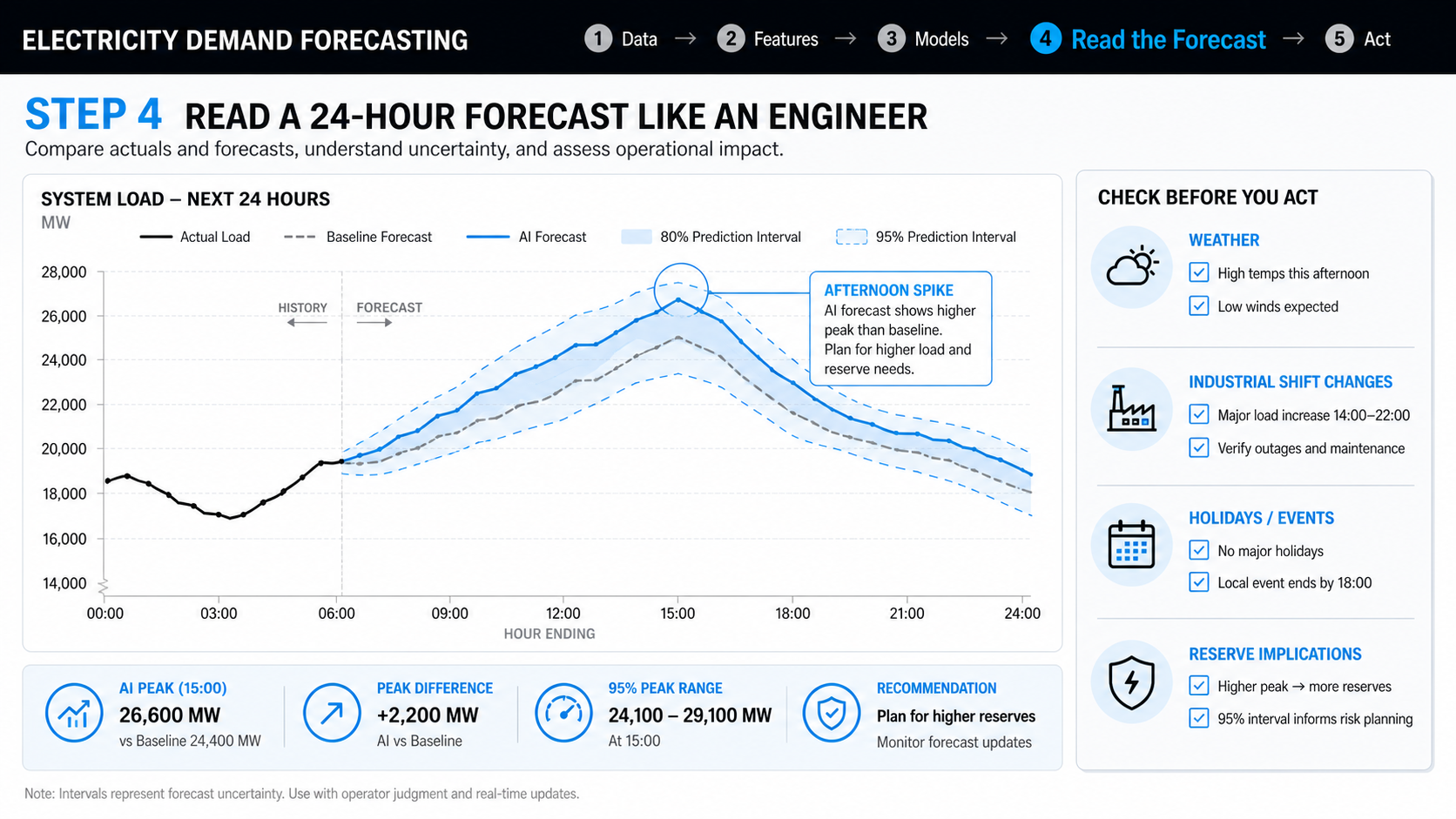
The output wasn’t just a single line snaking across a chart — it came with upper and lower bounds, which matters more than the point estimate itself once you’re the one deciding how much spinning reserve to hold in the bank.
Step 4 — Reading the Forecast Like an Engineer, Not a Chart
Here’s the part that’s easy to skip and shouldn’t be: a forecast is not a decision. When I compared the TimeGPT run against the following day’s actual demand, it tracked the shape of the curve closely and beat the seasonal-naive baseline on mean absolute percentage error, but it also smoothed over a short afternoon spike that lined up with a documented industrial shift change — a piece of context the model had no way to know unless I told it. That’s the pattern I keep running into with AI-assisted forecasting: the model is very good at the parts of the problem that are statistical, and still needs a human who knows the region to catch the parts that are situational.
In practice, that means treating the AI output as a strong first draft — worth building a plan around, but worth a five-minute gut check against anything unusual on the calendar before it goes anywhere near a dispatch decision.
Where This Actually Earns Its Keep
For an energy engineer, a workflow like this isn’t about replacing established load-forecasting systems that utilities already run — those are mature, heavily validated, and rightly conservative about new tools. Where it’s genuinely useful is everywhere those formal systems don’t reach: a quick sanity forecast before a maintenance window, a fast look at how a heatwave might stress a substation this weekend, or a first pass for a smaller cooperative or industrial site that doesn’t have a dedicated forecasting team at all. The barrier to trying it dropped from “hire a data scientist” to “spend an afternoon,” and that shift alone changes who gets to ask these questions.
What I’d Do Differently
Three honest lessons from running this end to end. First, data quality dominates everything — the hour I spent letting Claude hunt down and explain gaps in the EIA series mattered more to the final accuracy than which forecasting model I chose afterward. Second, prediction intervals are not optional; a single-number forecast invites false confidence in a system that is, by nature, uncertain. Third, no AI tool in this workflow understands your grid the way a local engineer does — the industrial shift change, the substation that always runs hot in summer, the holiday the calendar library doesn’t know about. Feed that local knowledge back in, and the forecast gets noticeably better; skip it, and you’re just building a more confident version of the same blind spot.
Back to that control room on a 41-degree Tuesday: the tools available to the person watching that demand curve have quietly gotten better. Not because AI replaced their judgment, but because it took the tedious parts of the job off their plate fast enough that their judgment is what’s left to spend on the moment that actually matters.
